New layout

Discussion in 'This Site' started by wfcSinatra, Sep 23, 2014.

  1. wfcSinatra

    wfcSinatra Predictor Choker 14/15

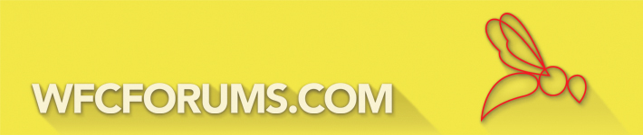
    Erm, nobody has mentioned the new design yet?

    Looks really good, the Hornet is slightly ******ed but good job!
     
  2. NathWFC

    NathWFC First Team

    I like it but "WFCFORUMS.COM" should definitely be black.
     
  3. Godfather

    Godfather bricklayer extraordinaire

    Nooooo!
     
  4. Godfather

    Godfather bricklayer extraordinaire

    the red menu bar needs some fine tuning (I'm using chrome). I'm not too sure about the drop shadow either (maybe the other way or smaller), otherwise very nice
     
  5. hornmeister

    hornmeister Tired

    Once the forum goes black it'll never go back.
     
  6. Vicarage Road

    Vicarage Road Reservist

    There's some right fussy ****ers!

    Looks great.
     
  7. Happy bunny

    Happy bunny Cheered up a bit

    Let's have a vote on black or red. Black to match the shorts, or red to match the hat?
     
  8. GoingDown

    GoingDown "The Stability"

    New logo looks a bit waspy.
     
  9. HappyHornet24

    HappyHornet24 Crapster Staff Member

    When I try to navigate some opposition forums to see what their fans' thoughts are ahead of or after a match, I appreciate how well run and organised ours is. So thanks & overall like the new layout.
     
  10. Norwayhornet

    Norwayhornet Squad Player

    Cant get at the site at work now also things look a bit too green for my liking (although entirely possible my cp3 is getting worse.)
    not that keen on new logo either.
    Sorry.
     
  11. UEA_Hornet

    UEA_Hornet First Team Captain

    You probably need to explain the work issue a bit more. What's coming up? My work isn't blocking it and they were during the malware issue a few weeks back.
     
  12. Eloden

    Eloden Reservist

    Bit garish tbh
     
  13. AshdonWFC

    AshdonWFC Prediction League Champion 2011/12

    I quite like it. Good work. There was nothing wrong with the old layout, but nothing wrong with a good refresher every now and then.
     
  14. UEA_Hornet

    UEA_Hornet First Team Captain

    It's good to see a break with the hated and feared Admin regime at long last.
     
  15. The Voice of Reason

    The Voice of Reason First Team Captain

    Sorry guys, not liking the new logo, though I was not that keen on the old one either :frown:

    Perhaps you could go for 3rd time lucky and have a logo design competition on here, as we have some very creative designers on this forum.

    Perhaps you could put up a poll to decide the winner assuming you get a few entries.

    EDIT:

    If you are happy with the logo, may I just make another suggestion: -

    I think it might look better reversed with the head of the hornet facing the lettering, rather than the tail.

    Just a thought.
     
    Last edited: Sep 29, 2014

Share This Page